Devsloka UI
A library of animated React and Next.js components, page blocks and templates that developers add to their projects with one shadcn CLI command.
- Role
- Creator
- Context
- Devsloka · 2025
- Stack
- Next.js, React, TypeScript, Tailwind CSS, Motion, shadcn registry
Overview
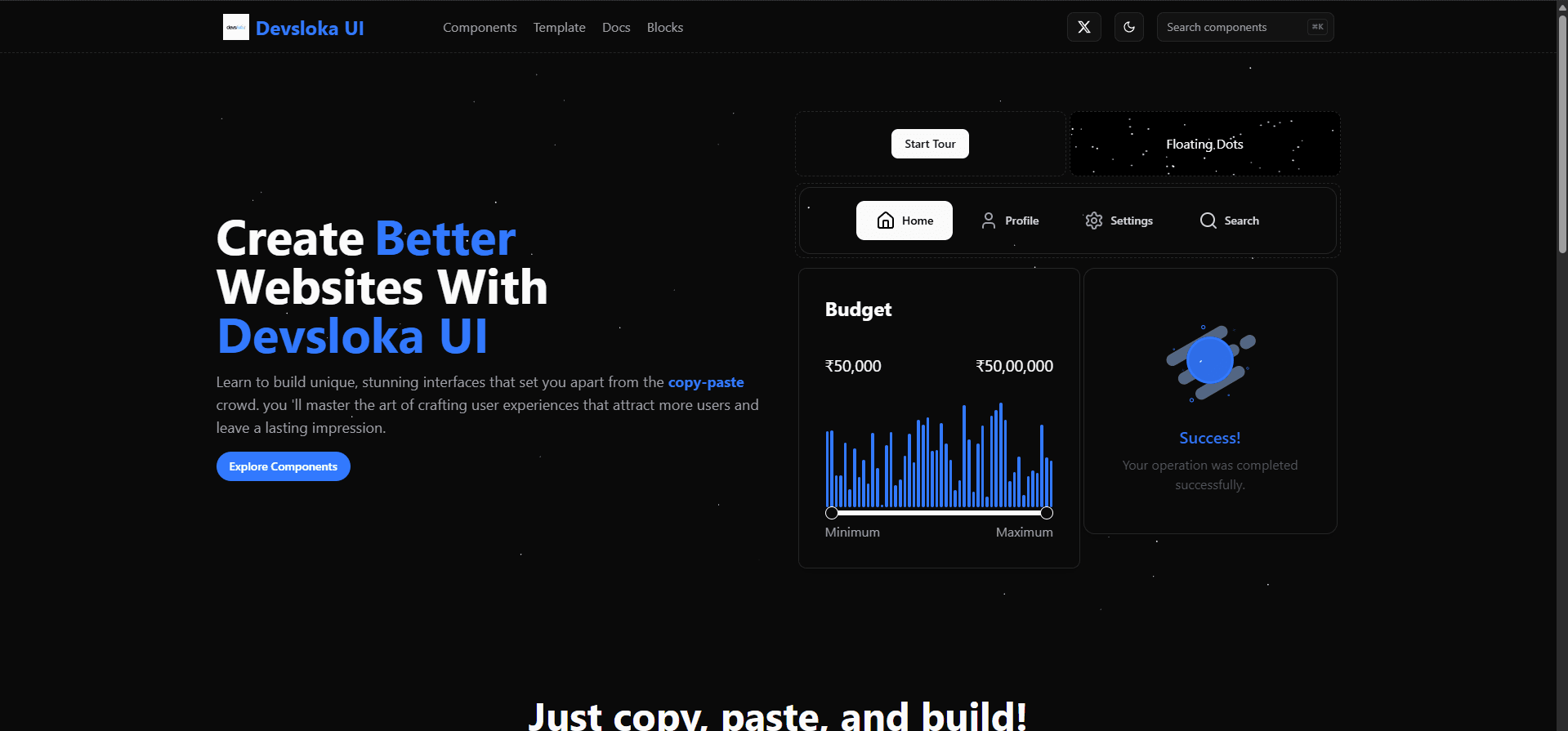
Devsloka UI is a component library for React, Next.js and Remix apps: animated components, interactive backgrounds, page blocks, templates and hooks, built to drop straight into a project.
Each item is published as its own shadcn registry entry, so developers install exactly the piece they need with one command and own the code from then on.
Components
- 01
Morphing UI
A shape-shifting nav with path-morphing icon transitions, plus morphing cards and a morphing modal.
- 02
Inputs
An animated multi-select, card and icon radio groups, and a budget range slider with a live histogram.
- 03
Showcase
Expanding cards, an animated image gallery, content and logo carousels, and product, pricing and Airbnb-style cards.
- 04
Feedback
Success, error and empty-result states, a loader, and a guided product tour.
Backgrounds & effects
- 01
Animated backgrounds
A 3D globe, galaxy and Milky Way, moon and stars, sky particles, noise, gradient and confetti backgrounds.
- 02
Text & details
Gradient text, text effects, floating dots and border-gradient icons.
Blocks, templates & hooks
- 01
Page blocks
Hero, pricing, features, testimonials, FAQ, contact, newsletter, team, logo cloud and footer sections.
- 02
Templates
Free templates for a developer portfolio and an AI agent landing page.
- 03
Hooks
useClipboard, useDebounce, useFetch, useForm, useKeyPress, useDeviceDetection and useDateFormatter.
Distribution
- 01
One-command install
npx shadcn@latest add https://ui.devsloka.in/r/<component>.json
- 02
Own the code
Components are copied into your project's UI folder, so you can change them freely.
- 03
Docs & search
A docs site with a ⌘K command palette, and a live preview and code tab for every item.